The Fed Dot Plod
Suddenly everyone is raising the number of Fed cuts this year and early next year. Without a doubt Friday’s job report was Weak with Few Redeeming Qualities. While we argued that the Fed SHOULD have cut at the July meeting – Building the Case for Rate Cuts and Know When to Fold ‘Em – there are several reasons why the market may be getting ahead of itself in terms of rate cuts and bond yields.
In any case, while last weekend’s title of Baby Pool Closed for “Maintenance” may be even more appropriate this weekend (clearly something is going on that markets don’t like), we are going with the Fed Dot Plod, because the Fed is now likely going to plod along slower than what the market priced in by the end of the week.
It is somewhat awkward to be bearish on the economy, while expecting the Fed to now disappoint, but we think there is evidence to support it.
Jobs and the Fed
According to Google trends, the “Sahm Rule” suddenly attracted a lot of attention. Powell even had to answer a question about it during the press conference. It makes sense that it would attract attention, but let’s remember that it is a “rule” only in the world of economics. Anywhere else it would be conjecture, based on logic, which has been useful in the past. However, I’m old enough to remember when inverted curves were a good rule of thumb to predict recessions.
In any case, while Friday’s job report was not good, it is questionable how much any one data point will change the Fed’s view.
- ADP, which came out Wednesday ahead of the FOMC announcement and press conference, came in at 122k jobs. Headline NFP came in at 114k jobs (even with 97k for the private sector). Since ADP changed its methodology to more accurately predict NFP we should assume that the Fed at least had an inkling that the report would be weak. As a side note, I wish ADP kept their old methodology of trying to track how many jobs were created or lost based on their unique data set because I think that it better served market participants.
- We sent out a quick note post JOLTs that the Quit Rate was at 2.1, tied with last month for the lowest since Covid and worse than the 2.2 average that we had in 2019. The Hires Rate was only 3.4, the worst since Covid, and below the 3.9 average in 2019. JOLTs was not strong. The “job openings” seemed okay, but we have concerns that it doesn’t do a good job of catching “ghost” jobs, “fishing” expeditions, or even those jobs that used to exist, but no one has bothered to remove them from the job sites. The payment plan for many sites/companies doesn’t create the incentive to remove job postings the way it used to with traditional/old fashioned approaches.
- While ISM employment was abysmal, what happened to all of the people who as recently as last month were quick to point out manufacturing is only a small part of the economy?
The case that the Fed should have expected weakness, even with relatively little “new” information since Chair Powell told the world that the labor market was in good shape, seems at least somewhat convincing.
Let’s not forget that he repeatedly told us that the Fed will not react to a single piece of data.
Now, let’s move to the more interesting, curious, and weird part of this report – the willingness to believe in bad data.
The Willingness to Believe in Bad Data
The theme of “garbage in, garbage out” is a recurring topic in T-Reports. What is incredibly concerning, from my perspective, is the willingness to take data that might be questionable and use it to make policy (or longer-term decisions). For trading, whatever the number is, it will move markets. However, and this hurts my head, this is in part because we know policy makers look at the data as is, which lets algos loose to trade on it. It is only over time that reality hits and decisions made based on bad (or questionable) data become apparent.

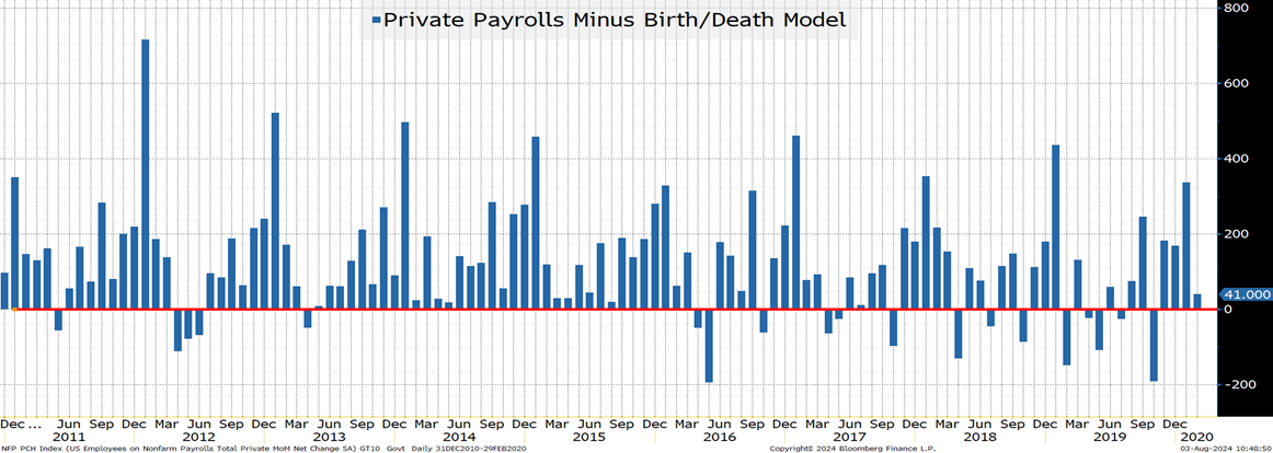
Here we examine private payrolls versus the number of jobs purportedly created (the birth/death model). From January 2011 until February 2020 (just before Covid hit), we see relatively few instances where the number of jobs created by the model was greater than the number of jobs reported (appears as negative numbers in this chart).
It occurred 19 times out of 111 data points (17%). The average for this period was 124k. Though you can see that since 2016 the frequency has increased, which we continue to associate with the rise of the “gig” economy creating many more “self-employed” people.
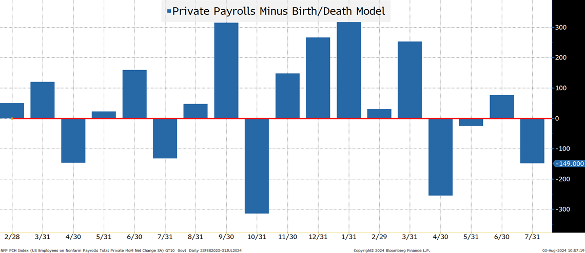
Something seems to have happened since February 2022. Yes the data is cherry-picked, but it is quite striking, and very different than anything we have seen in the past decade during “normal” times (the Covid shocks make a mess of a lot of the data).

Since February 2023, 33% of the reports would be negative for private jobs if it wasn’t for the birth/death model. The average number of private sector jobs (taking out the birth/death adjustment) dropped from 124k to 44k.
I’m not arguing that the birth/death model makes sense, but what I am arguing is that it has become a disproportionately large contributor to the total number of private sector jobs.
Maybe it makes sense, or maybe the model hasn’t been properly calibrated to deal with work from home, the GIG economy, or the shift from being employees to setting up LLCs, etc.
While the Fed (and especially the media) seems happy to take the NFP reports on full faith and credit, color me skeptical.
Just a quick note on “revisions.”
“2-month total revisions” should have the most updated information as it provides more time for survey responses to arrive. According to the BLS Survey Response Rates, the response rates remain low (I was focused on employment, though CPI housing also caught my eye). Again, what is the “fudge factor” and how good is the BLS at it?
When looking at 2-month net revisions (a bit overstated, I think due to double counting), we’ve had 14 of the last 18 months revised downward. That seems statistically unlikely. It also shows a rather significant number of total downward revisions.
Where I am coming out on the jobs data:
- Initial, headline numbers – American Exceptionalism.
- Looking into details, examining trends on revisions, data “plugs,” and estimations – American “meh-ism.”
In the U.S. you don’t convict someone of a crime if there is a “reasonable doubt” so why would we make policy on data that, at least for me, also creates a “reasonable doubt”?

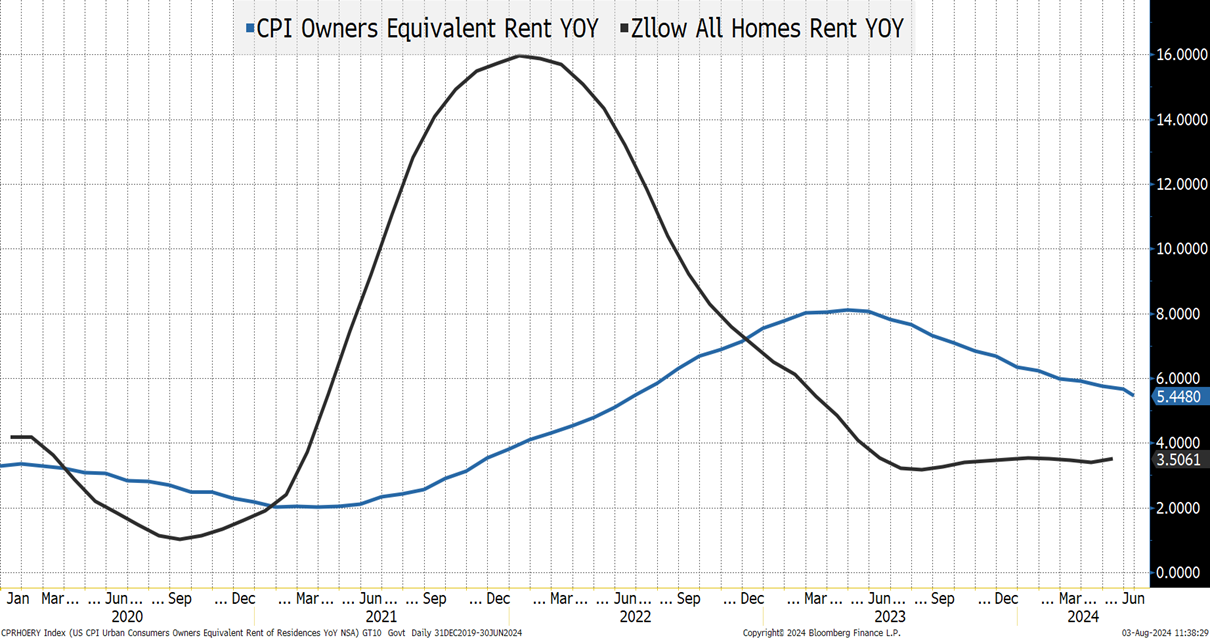
Speaking of crimes, which data set do you believe? The CPI Owners’ Equivalent Rent or Zillow’s?
This chart seems to highlight a few things:
- The Fed was slow to hike because they were using data that was not capturing the move in rents! It is almost impossible to believe that anyone reading this report didn’t face this issue directly, or with family or friends! Rents were skyrocketing in 2021 while we were still embarked on QE.
- The “pain” the average person felt around inflation, which seems to show up in sentiment surveys, seems to reflect the Zillow pattern better than the OER pattern. Across the board, people seemed to experience a much higher level of inflation compared to what actually made it into the official data.
- Now, the OER is “catching up,” and we seem (at least to some extent) to be letting what is likely a number higher than reality affect CPI – and in turn policy.
Why we talk about CPI, where shelter has a relative importance of 36%, with such obvious flaws, is beyond me! Supposedly, OER, at one time made sense, and was the best we could do (we also used to have to lace up sneakers), but does it make any sense today?
At Academy, we often discuss the risk of fighting the last war, and not only does the Fed seem to be fighting the last war, but they are also fighting it with bad intel!
Should Versus Will
Clearly, we are in the camp of they should cut! That they should have cut! That they are behind the curve!
So why are we hesitant to join the crowd expecting the Fed to suddenly accelerate their cuts?
- The Fed, the media, and many others have been comfortable with taking data at face value. So, why would they start digging into this in more detail now?
- The Fed has told us, in no uncertain terms, that no single data point will define policy. They weren’t willing to cut on Wednesday and there really hasn’t been that much “new” data.
- The Fed (or at least enough influential members) has been so scared of a resurgence in inflation that it seems difficult to believe that they will do an about face or even panic any time soon.
- At this point, I do agree that enacting the Fed “Put” would trigger inflation. While I think we are seeing inflation come under control, and some areas are even experiencing deflation, if the Fed does anything that looks or smells like they are eager to embrace the Fed Put, we would likely see inflation – starting with risk assets. They are caught between a rock and a hard place in terms of being able to be aggressive.
- No one wants to admit they were wrong (clearly, I have to revise my target on 10-year yields, as what looked good 6 trading days ago, makes no sense now). That applies to the Fed as well. They just had their biggest stage. Fed speakers are now on the circuit after the 2-day meeting, followed by a 45-minute press conference. How do you back off those decisions and words, when, for all intents and purposes, nothing much has changed?
- I am quite literally scared about how politicized any decision they make might become. It won’t be a political decision on their part, but I think a 50-bps cut in September would fuel rage on social media which could spill into the real world. Maybe I am overestimating how strongly some segments of the population can be made to feel about a rate cut in terms of helping or harming their candidate, but I have moved to trepidation (if not fear) on this risk.
Maybe we will get more cuts (sooner), but the market got ahead of itself.
Liquidity, De-Risking, Vol Selling, and More
I’m getting tired of writing, and you are probably getting tired of reading, and we’ve covered these before, so we will be brief:
- Liquidity. The world of algo-driven “faux” liquidity is being tested almost daily (in both directions) and it is not going to get better. Lack of liquidity works in both directions – just look at Wednesday’s stock surge.
- De-Risking. The ETFs I’m tracking most closely showed mixed results early in the week, but moved towards “buying the dip” as the week went on. XLK, QQQ, TQQQ, SQQQ, NVDL, and ARKK pointed to some risk taking and certainly didn’t scream “capitulation.” That may lead to a bounce, but I remain convinced that the worst is not behind us.
- Picking up nickels in front of a steam roller. That is a polite way of saying one of my favorite Wall Street phrases – “Eat like a mouse, poop like an elephant.” Vol selling has become “de riguer“ in this market. Any self-respecting RIA has their clients selling vol – directly, via funds/ETFs that specialize in those trades, or even, perhaps unwittingly, in leveraged ETFs. Many write puts because “if the stock gets there, you want to own it anyways.” My view remains that what they really mean is “if the stock gets there, for no good reason, you want to own it” as more often than not price drops are associated with negative news that make what was at one time a good and obvious price a little more dangerous. Also, it helps if you weren’t fully invested and didn’t write too many puts, otherwise you might need to sell rather than buy.
- The Japanese Yen. The strength there is sparking a lot of chatter about the “unwind of carry trades” where investors borrowed cheaply in depreciating yen to buy other assets. I’m never too sure how big or real that risk is, but with the JPY appreciating almost 10% in less than a month it is something to watch.
- Fake passive. When indices, from narrow to broad, become heavily concentrated in a handful of stocks, your intuition on “passive” is likely to be incorrect. Selling pressure (which we’ve seen less of than I would have expected given the moves) will hit the big leaders. Since momentum has been the best factor, that leaves us open for more selling. Just like inflows went disproportionately to a handful of companies enhancing their narrative, outflows will also hit them, through no fault of their own, other than the success of their stocks. Hopefully, stock pickers will win here! Since June 30th, the S&P 500 equal weight index is up 1.5% while the regular (market cap weight) index is down 2%.
Bottom Line
The Fed will be more “plodding” than what the market has priced in.
- S. 2s vs 10s is the least inverted since June 2022. Continue to look for “normalization” as the Fed can control the front end, but not much on the back end.
- While we had been looking for weaker economic data, I was shocked (painfully) by how quickly 10s moved and got below 3.8% to finish the week. I’m incredibly bearish, at least for a trade here, as I cannot find a reason (in anything I look at) to bring my range below 4% – 4.2%. I will have to adjust to the case that while we’ve been comfortable thinking about a slowing economy and lower inflation, it was not as widely held as we thought.
Stocks. We continue to think that we have not seen the bottom and that we will be lower at some point in August than we are today (cannot discount a possible bounce again from here, but am waiting for lower levels to buy this market). On the Nasdaq 100 the current target is 17,500. Just below the 200-day moving average, where we would expect support, though that is still above the April 19th low of 17,000. If anything, the risk of breaching that remains high. The S&P 500 is a bit trickier as it is still above the 100-day moving average, but 5,000 seems like a good target (the 200-day moving average and the April lows).
Buy energy here on the recent weakness. Yes, the economy is slowing. There are more and more questions about whether AI, Data Centers, etc., and everything associated with it (power for example) got ahead of itself, but geopolitical risk is extremely high and anything we see on that front will lead to supply shocks for energy.
Credit. Should outperform, but it will start moving much more in line with equities as the equity move is starting to reflect more than just valuation concerns. Credit spreads were well protected against valuation concerns but will not be as protected as we move into “bumpy” landing concerns. Lower Treasury yields won’t help spreads, and we should see a much larger than expected August calendar develop to take advantage of the move in all-in yields.
Holy recession, Batman! We’ve been on the side more concerned about the economy for some time now. It felt like we were swimming upstream at times, and Wednesday’s stock surge felt like we were swimming in a baby pool “closed for maintenance.” Then suddenly recession is on the tip of everyone’s tongue! Deservedly so, but wow, did that happen fast!
Good luck, as this summer is turning more turbulent rather than less turbulent!


