
Supply & Demand vs Data
The summer is officially over for Wall Street. Though if you were on the debt capital markets side of things, there was barely a lull. It was a record August on the public credit side of the equation, and we expect September to get off to a roaring start.
Today we will expand on some topics raised in Friday’s Amazing Job Report. Not so much on the jobs front but rather on the Fed and Rates side of things.
Inflation and Jobs Data
The jobs report was great. Last month’s report, which initially looked awful, was now supposedly very good. Why can’t we revamp how we collect jobs data? One simple starting point could be:
- Track the number of people who get one or more paychecks during the month. That would seem to cover a big part of the working universe. Make it mandatory to send this data to the BLS (or have the IRS calculate it). It isn’t like the IRS won’t get all your data by the end of the year, so what’s the big deal?
- Then we can track changes in this metric in real time. It might not capture the entire working world (I guess there are people who don’t get paid with some sort of check/direct deposit). We could also track by social security number, EIN, and the payee info.
- I think we’d get a pretty accurate report that we could compare month to month, on data that seems readily available (and that the govt will get eventually, if not in real time).
- From there we could debate what is happening in the labor force that isn’t getting a paycheck. There is probably some variability in that, but we’d at least have a pretty accurate picture of what is happening in the world of those receiving paychecks.
But I digress. Actually, I don’t think I digress, as far more time, energy, (and $$$) need to be put into our data collection to avoid the current state where too often we see Garbage In, Garbage Out.
But instead, we will all probably have heard “Fed’s favorite inflation” metric a thousand times by Tuesday afternoon (it would be even more, but we need to allocate some space for “the refs helped Michigan win!” discussions). We will incorporate the data into our thought process on rates because we “have to,” but I do think it is silly. The “annual” rates often seem particularly silly, since, as discussed on Friday, they pick up “higher prints” that are “stale.”
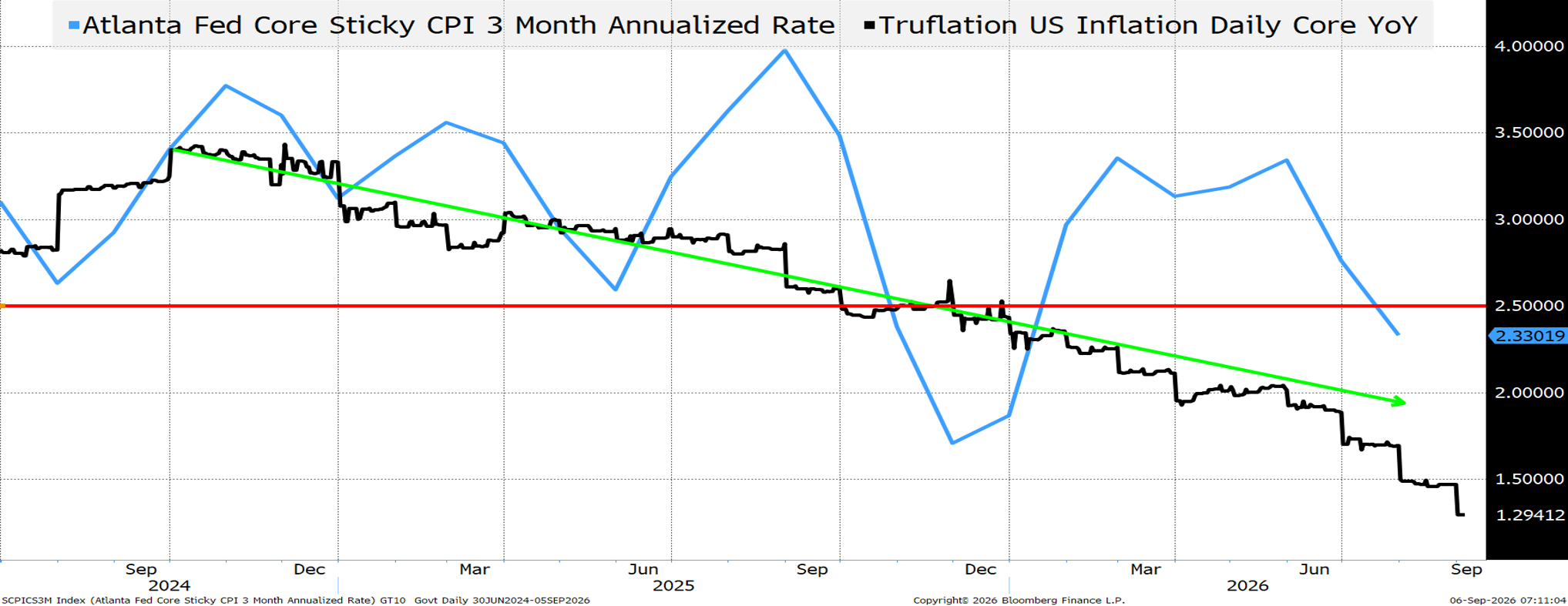
The Atlanta Fed calculates “sticky core CPI.” It is data produced by, checks notes, the Fed, who is in charge of monetary policy.
- The “annual” rate is 2.7%.
- The 3-month annualized rate is 2.33% (much closer to “target”). The red line is the “unofficial” target of 2.499% which does round down to 2%. 😊 Why is that not more useful than the annual rate? What is surprising (I think) is that the rate is coming down even while the War in Iran continues.
Truflation has its own set of issues, but is now below 1.5% and has been trending incredibly well. Should that really be completely ignored in favor of some “favorite” measure?
Then let’s just touch on “shelter” because it really is important.
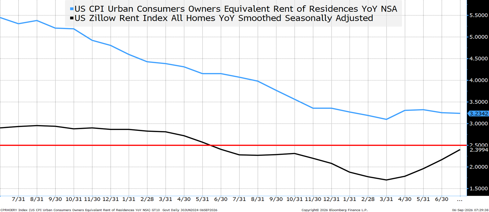
The owner’s equivalent rent has not been below 3% for years. Zillow has been below our 2.499% level for well over a year. You can check out the OER Factsheet on the BLS website. Here is a quick excerpt from the report:
Equation 2: calculation of the monthly relative of price change for rent in area α

The numerator and the denominator in the formula are weighted averages of the economic rents in month t and t-6. The weights are the sample unit weights Ui,α adjusted by the rent factor αi,α. Dividing the average economic rent for the current month (t) by the average economic rent from 6 months earlier (t-6) yields the 6-month relative of price change. The sixth root of this relative is the 1-month change in rent for index area α.
Complex mathematics for a company that specializes in tracking things like, checks notes, rental prices in the housing sector. It seems at least some consideration should be given to the possibility that OER is gobbledygook that can be replaced by some better way of calculating and processing what people pay on shelter.
I’m sure markets will react to the PPI and CPI reports this week, but I’d pay more attention to annualized trends than the annual data.
I really am hopeful that by the start of 2027 there will no longer be a “favorite” inflation metric, and a much more valid conversation can be had around a variety of metrics (that can be analyzed holistically).
U.S. IG New Issues Have Doubled In Just 3 Years!
Hopefully, this subtitle made you look!
2023 had $1.2 trillion of U.S. IG bond issuance. 2025 was $1.7 trillion. 2026 is already at $1.6 trillion and will likely surpass 2025’s total by the middle of next week.
But that isn’t “double.”
So how do we come up with this “doubling?”
- Do we include private credit? No, but that would just add to the argument about the size of the debt market.
- Do we try to include structured notes and off-balance sheet transactions? No, but that would also just add to the argument about the size of the debt market.
We try to capture the duration that is being sucked up by U.S. IG New Issue.

While 2026 debt issued will beat 2025, the total volume doesn’t do justice to the duration being sucked out of the market.
There are a lot of charts floating around that show the weighted average maturities of debt issued in a given time frame. That is helpful, as it demonstrates that on average, the maturities are getting longer. But that doesn’t account for the amount of debt.
In our rather simplistic calculation, we take a dataset of IG new issues from Bloomberg (it doesn’t tie exactly to the league tables but seemed close enough). We then take the duration of each bond at new issue (DV01 would be better; that would have required letting too much of this beautiful weekend go to waste, so we settled on duration, for now). We “fudge” it a bit for floaters and dropped perps (which makes our calculations conservative rather than aggressive).
So, this simple calculation of duration multiplied by millions of bonds gives us some framework to compare the duration demand that has been getting sucked out of the bond market.
Long Dated Treasuries Face Stiff Competition on the Supply Side
It isn’t just the amount of corporate debt being issued, it is the higher DV01s being issued in the past that are competing for investor allocations to duration. The chart above is certainly not the best way to measure the duration competition, but it isn’t completely irrelevant either!
Private credit is competing not just with public credit, but also with Treasuries.
Sovereign Debt issuance is increasing as well. The amount of Bunds outstanding (German government debt) has grown by about 40% in the past 5 years. Not big, in and of itself, but part of a trend for more debt globally. That global supply is only going to increase as countries (in pursuit of their own ProSec™ strategies) will be issuing more and more debt to fund defense and infrastructure.
The Demand Side of the Equation Isn’t Helping Yields Either
From Friday’s report (for those who didn’t read it and to save you the trouble of clicking on the link provided):
Norway announces reductions in allocations to sovereign debt. The Saudis are looking for loans, so presumably buying fewer Treasuries (according to TIC data their holdings have dropped from $160 billion to $142 billion since the war started). Japan, with over $1 trillion in Treasuries, has seen their holdings decline, and presumably they won’t be buying a lot of Treasuries while trying to strengthen the yen (a policy move supported by Bessent). No idea what Canada or the EU will do, but difficult to imagine them adding to Treasury holdings while trying to raise money to support defense and infrastructure spending.
Nothing in here is meant to indicate nefarious or anti-American selling (though there is an element of risk to that). It is simply that we are living in a world where supply of debt is increasing and potential sources of demand seem to be waning.
What about the 60/40 portfolio? While the 60/40 allocation (60% equities vs 40% bonds) remains popular, it is easy to find more and more advisors questioning it. Bonds have not been acting like a great hedge. With life expectancy increasing and the stock market booming, 40% in bonds is deemed too high by many (or more accurately, the argument for owning more “risky” assets, like stocks, for people with multi-year (or decade) time horizons has been gaining traction). I suspect this is playing a minor role in rising bond yields, but is a factor worth considering.
With a lot of confusion over the direction of longer-term yields, and a Fed that is almost certainly not going to cut any time soon (I’m firmly in the NO HIKE camp), it is easy to see why Joe Tarditi at Academy is quick to point out the all-time record allocations to money market funds.
The Treasury is taking advantage of tapping into that pool by issuing T-bills. That allows the Treasury to issue fewer longer-dated bonds, but is kind of a drop in the bucket relative to the overall supply and demand dynamics.
The User Fee Wildcard
I really don’t want to go here, as it seems like a horrible idea, and hasn’t really been floated in a long time, but with the President ramping up his frustration at high yields and deficits, it would seem remiss not to mention that Miran, in the past, published papers on a variety of topics, including a “user fee” on foreign official (central bank and sovereign) holdings of Treasuries.
I expect that “work” to stay buried as it seems against much of what Bessent would advise, but kind of makes you think.
The Fed Operation Twist Wildcard
If the admin wants to get serious, a Fed Operation Twist is The Real Deal. Hiking and “favorite inflation metrics” have been the flavor of the day, but this remains a powerful tool that should be on the table (it probably isn’t, but it should be).
Equities May Face Some Supply Issues
Academy, like all of Wall Street, is excited about the rejuvenation of the IPO market! It is great seeing new companies go public, providing different risk/reward characteristics than existing companies. It has also been compelling to see existing companies issue equity to get ahead of the compute spend.
We expect to see a wave of new IPOs. The market is strong and looking to add new and unique profiles. AI and compute will lead the way, but there are a plethora of opportunities, many of which fit nicely into our ProSec™ framework.
Again, some of these new listings will have market capitalizations that used to belong only to longtime public companies.
There will be some lockups expiring on earlier IPOs.
Quite frankly, for the vast majority of these companies, Treasuries 10 or 20 or even 50 bps higher than where they are now is a non-issue.
It should be a hectic market for equity capital markets (alongside debt capital markets). Markets are strong enough to absorb the supply, but it could be a bit of a headwind.
Bottom Line
Continue to like owning “compute” bonds on a yield basis (no rate hedge). Supply should come, but investors have set aside capital to buy this paper.
Be cautious on the longer end of Treasuries. This is far more about supply and demand, and market supply is not helping. The demand side isn’t helping either, and so far Treasury has brought out the peashooter rather than the bazooka.
On the front end, buy whenever the market gets close to pricing in 2 hikes by January, and sell when it goes down to a ½ hike priced in for this year (I still do not think we get a hike, but need data, even my alternative favorites, to support that).
Hearing a lot more about rare earths and critical minerals as the meeting with Xi approaches. Maybe the meeting will go so well that any fears will be assuaged, but I’d be adding to energy, infrastructure, domestic production, and commodity processing, refining, and smelting bets ahead of the Xi meeting, both domestically and globally.
Normally we could say something like “Let’s Get Ready to Rumble” as we get past Labor Day, but it seems like we never stopped rumbling this summer. 😊
Look for supply and demand to be more important than data in the coming weeks.